
Wednesday, 7 January 2015
Final Design
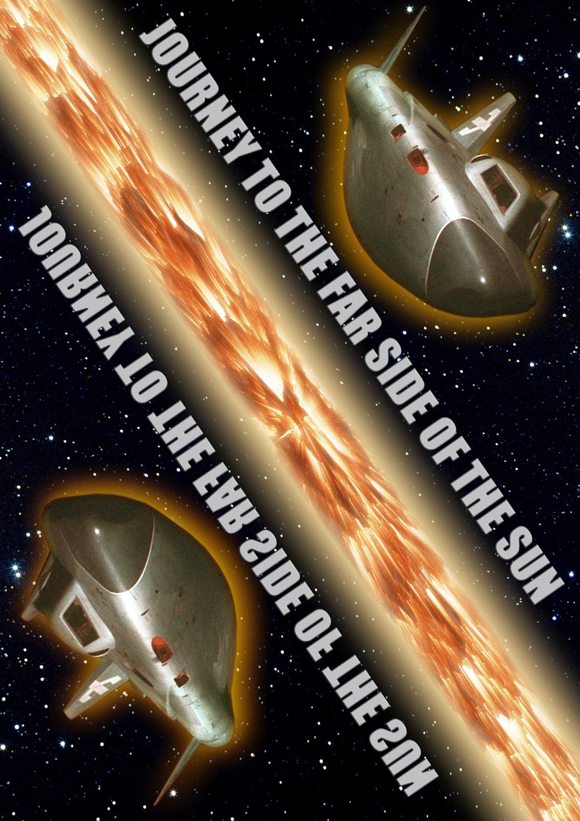
This is my final Photoshop design for my film poster. The final change made here is that the position of the text is changed to take in the fact that viewers will look at the top of the poster first before looking down the rest of the image.
Third Photoshop Designs
My third design removed any direct film imagery and focused on the two Earths on either side of the Sun. This was an attempt to create a symbolic image that gave clues as to the more narrative side of the film, such as one of the Earths being flipped. As I progressed with my designs, I altered the type font to 'Space Age' to keep in with the Science Fiction theme of the movie and I also added a 'flipped' copy of the credits, so that if you tuned the poster upside down, you could see how the poster would appear on the parallel Earth.


Second Photoshop Design
My second design was an attempt to make the spaceship the focus of the poster, depicting it as travelling along one side of the sun, while its parallel doppelgänger travels along the other side in the opposite direction. However, I soon abandoned this design because I could not get the layout to work properly and I was not satisfied with the image of the sun, which is horribly compressed. As a concept sketch, I felt that the design had potential, but when realised on the computer, it looks unrealistic and unimpressive.

Initial Photoshop Designs
Using my sketches for layout reference, I began to put my film poster together on Photoshop, deciding to use the theme of Parallel Earths as my theme. My first design was fairly crude, and to me it felt unprofessional. I was particularly dissatisfied with the background imagery and the font colour of the text, as they both felt quite boring with no real depth to them. However, I liked the image of the astronaut and his parallel duplicate looking at each other, so I decided to retain that for the design.

I decided to change the layout of the title so that it was central and altered the font colour to a more metallic light grey. As for the background, I changed the Star background to one that was less busy, and I then place on image of the sun on top, to make the image look more dramatic.

I next put in poster credits, using the original poster and the poster for the film 'Drive' as references.

However, I still felt that the imagery of the sun could look more dramatic, so I enlarged the image of the sun and placed an image of the Earth behind. The image of the Earth is flipped, to give a clue as to the nature of the story concerning parallel Earths. I also included the films original tagline at the top, to put dramatic emphasis on the film.

Ultimately however, I felt that the poster I had designed was to similar to the original DVD cover of the film, so I decided to revisit my sketches to try something different.
Development Sketches
Following my initial sketches, I did a few more for development. I decided to concentrate on 'Journey to the Far Side of the Sun', as I felt that was the film which I could do the most designs with, due its various plot themes, such as space travel and parallel worlds.
I did do an additional sketch for 'Star Trek Into Darkness', which would have been a montage of the various official posters released, but I decided that this was an original idea for my designs. I also Considered working on 'Gladiator' and did a quick Photoshop test, which showed both sides of the lead characters head in his helmet. However, I could not find the right reference imagery to use to make the poster, such as a Roman Colosseum that was not in ruins, so I decided to focus on my first choice instead.
I did do an additional sketch for 'Star Trek Into Darkness', which would have been a montage of the various official posters released, but I decided that this was an original idea for my designs. I also Considered working on 'Gladiator' and did a quick Photoshop test, which showed both sides of the lead characters head in his helmet. However, I could not find the right reference imagery to use to make the poster, such as a Roman Colosseum that was not in ruins, so I decided to focus on my first choice instead.
 |
| 'Journey' Development sketches 1 & 2 |
 |
| 'Journey' Development sketch 3 |
 |
| 'Star Trek Into Darkness' Development Sketch |
 |
| 'Gladiator' head Photoshop test |
Subscribe to:
Comments (Atom)